

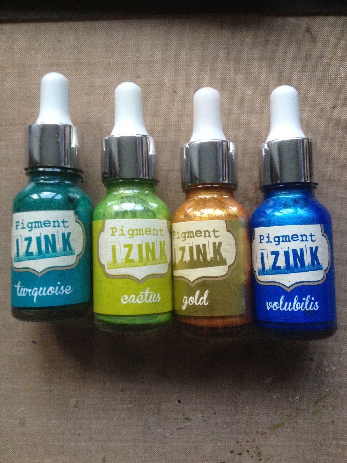
The product I've used is IZINK, I think it's been around a year or two and a few months ago Aladine who make it and Clearsnap who distribute it bought out several new colours including pearlescents.
I only recently became aware of it and thought I'd share some of the results of dipping my toe in the water with it. Before Christmas I was looking for quick ideas for Christmas cards and saw a you tube video by contadinaK (title- dry embossing and paint) and that was closely followed by a Donna Downey one exploring the same product so I thought 'ooh that looks interesting' and yes I was tempted and the basket magnet worked it's magic! There are several IZINK videos on you tube if you want to know more about the product and some project ideas.
My understanding is that because Pigment Ink has pigment suspended in it, it's therefore thicker than dye inks and that affects how it reacts. Apologies for poor lighting in some of the photos, role on lighter nights.

On the left is Black India Ink, the right one is IZINK API in cactus


Distress re inker in wild honey v turquoise API sprayed with water and I've used watercolour card stock
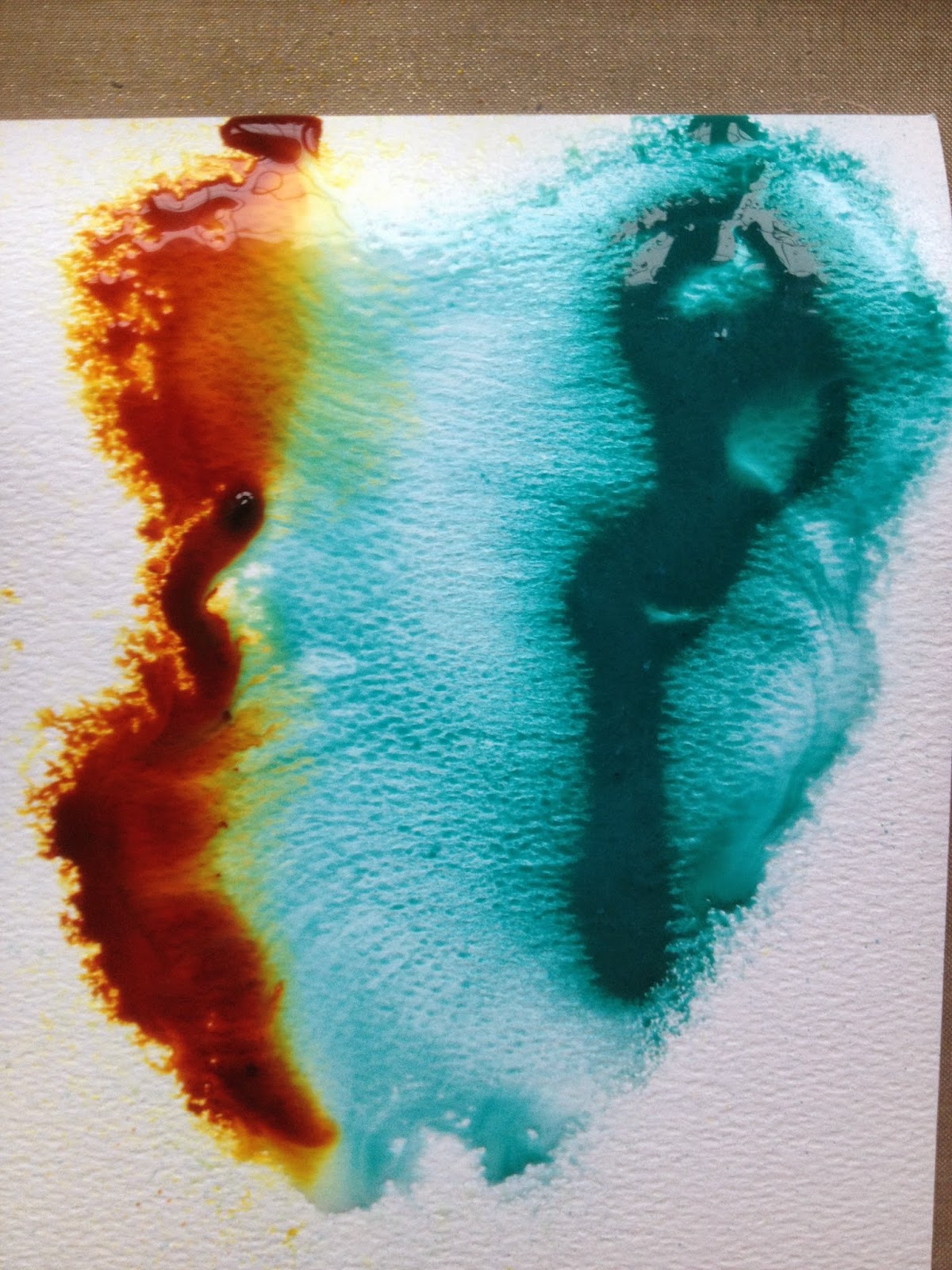
I thought this experimental piece had potential, the wild honey has spread but the API although remaining thick in the central part, spreads out even quicker. I think this quality and how it brayers are what I most like about pigment inks.

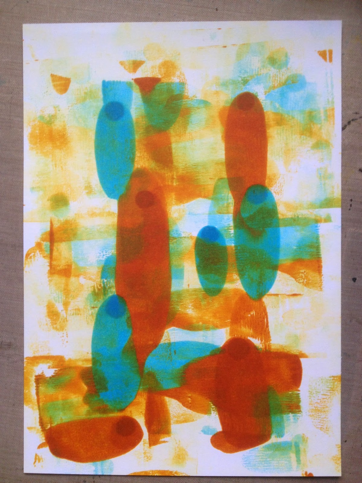
Brayered Distress Inks and Smoothy stamping card
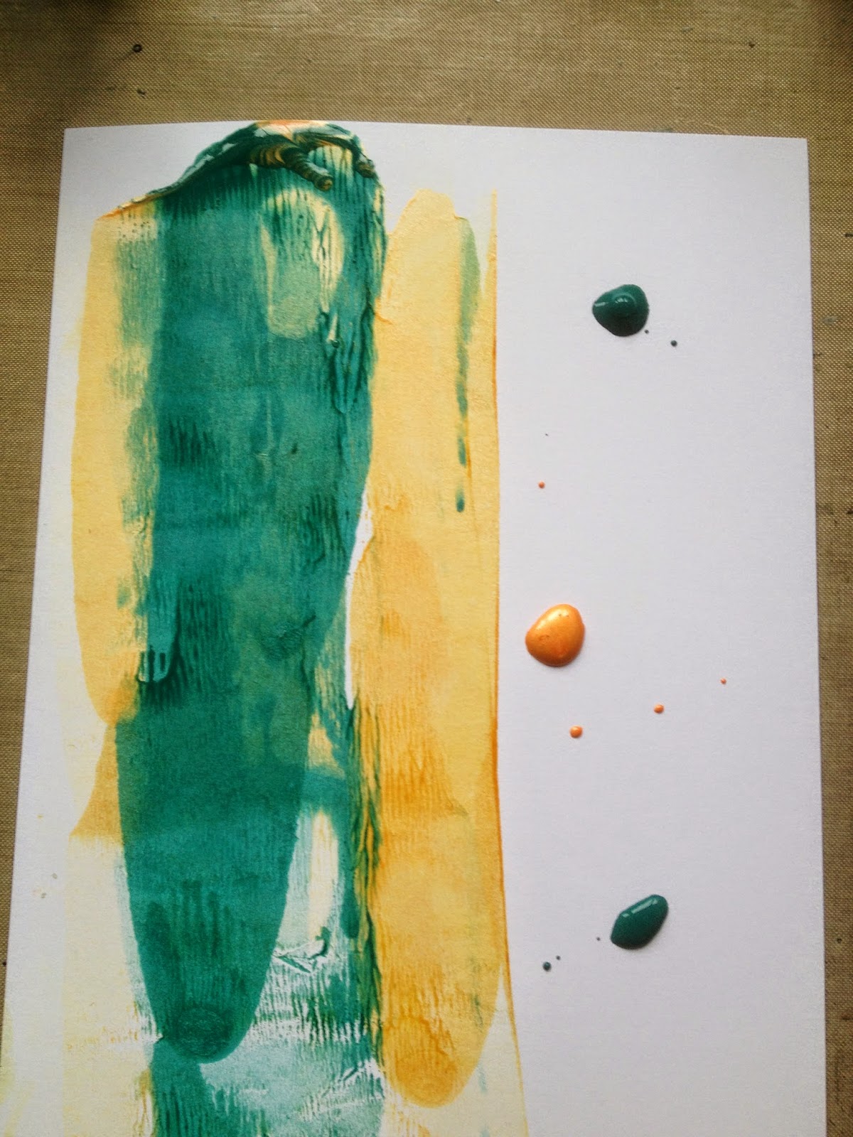
Brayered API...much thicker so doesn't sink in the same and spreads more.

On metal foil sheet, you can see that it's more gloopy and can leave a nice texture.

On foil and any non absorbent surface you only need a tiny amount and it must dry one colour before you put the next layer on or they will just blend together. It dries very quickly though. This is on glossy card stock.
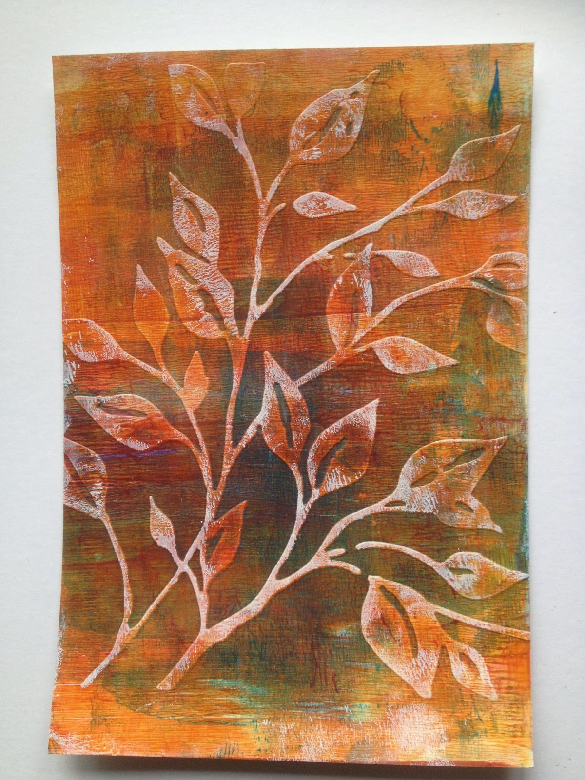
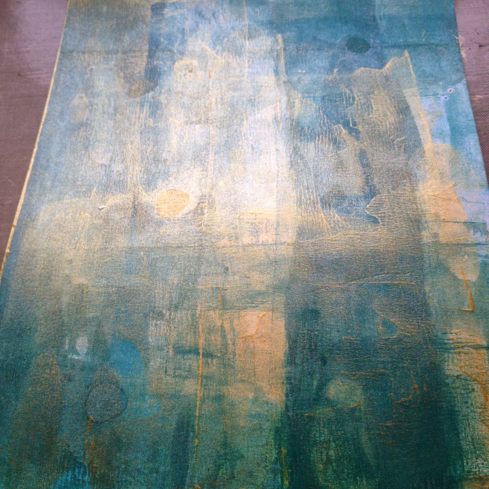
The dry embossing technique from the video followed by gesso lightly brayered over.
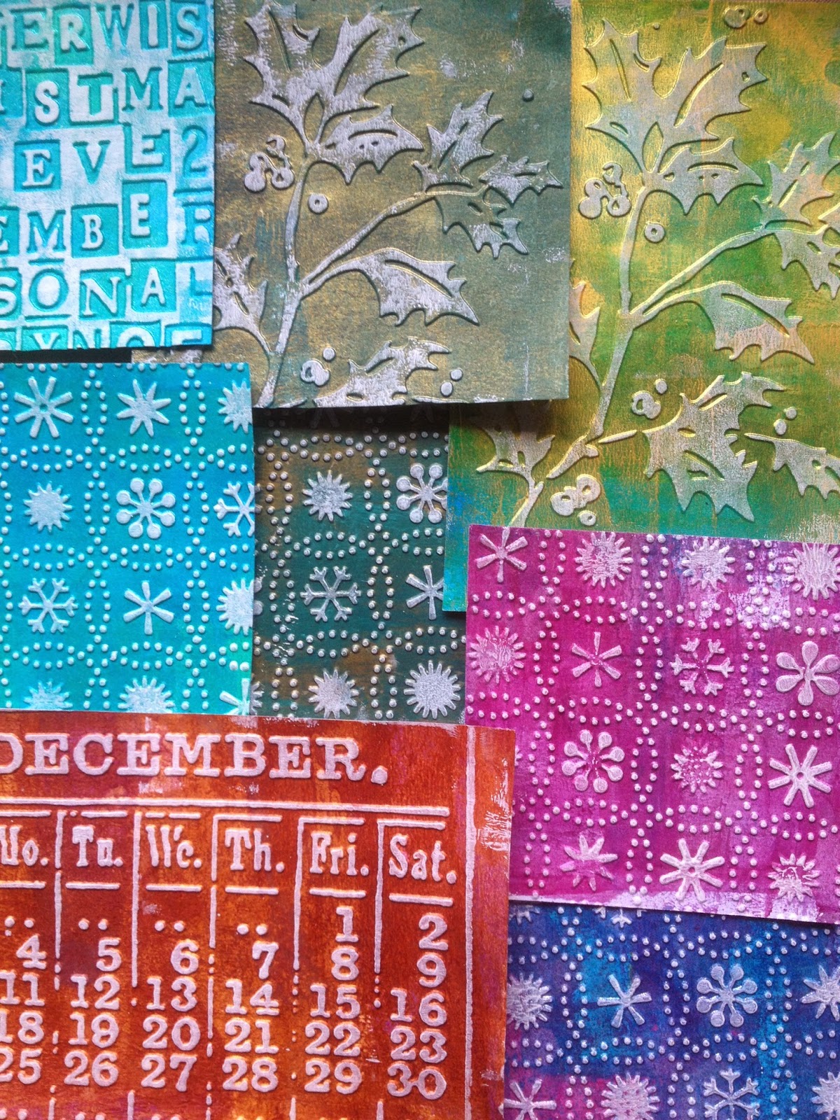
The same technique as the base for Christmas cards. Love the holly top right.

I was inspired to create some journal pages out of these. I didn't feel the first needed much more so I've just added some simple stamping with Stampers Annonymous SCF005 and black stitching around the pigment ink. Tension stitch not quite right but it works!


I hope I've encouraged you to experiment with Acrylic Pigment Inks or maybe products you've already got, just to see what else they can do....you maybe surprised. You might even share your results with us in our current challenge which is appropriately 'Fresh Beginnings', you can find the details here, there's one more week to enter.
Thanks so much for stopping by. Ruth x
Fabulous Ruth! Love the stitching around the ink shapes, they almost look like feathers.Sue C x
ReplyDeleteNeed to get me some playing done!
ReplyDeleteSally
Wonderful Ruth,I've seen these and wondered just what they were like. Your tutorials are always really helpful.....now I NEED these too.....sigh....
ReplyDeleteBig hugs
Donna xxx
Fantastic project Ruth.
ReplyDeleteYvonne x
Wow, so many different experiments and all of them look great! Never hear of those inks before, - oh dear, yet another product to be tempted by..... All of your makes look super as does the journal spread!
ReplyDeleteI love your experimentation Ruth, you have created some wonderful pieces here, I really like the blues and browns together and the stitching adds another great dimension. Great work! Anne xx
ReplyDeleteLovely! So glad you shared these experiments! Thank you!
ReplyDeleteThank you for sharing the results of your experiments Ruth. Have seen these demonstrated by Sara Naumann via You Tube, i think she does a lot of promotional work for Clearsnap.
ReplyDeleteYour sewing helps to define shapes and gets them to pop off the page. Two stunning pages, lovely colours and something to try and catch at a craft show demo so i can try before i buy :-) xxx
What a fab product revue Ruth not to mention wonderful samples! Definitely something to add to my wish list! Love your journal pages (even though I don't journal love looking at other people's). The colours are gorgeous.
ReplyDeleteHugs
Lesley Xx
Wonderful step by step Ruth and so inspiring. Never used these inks but love what you have created. TFS
ReplyDeleteAnnie x
Thanks so much for sharing the results of your playtime with us... What an inspiring post. I love the gesso'd dry embossing and the journal pages at the end are beautifully done - especially with that touch of shaping and texture from the stitching. Brilliant!
ReplyDeleteAlison xx
This is a wonderful tutorial Ruth! I've been meaning to pop by for ages but you know how the time flies. I love how you've shown the behaviour of these inks on various surfaces (love the effect on the foil card). The stitching works a treat too! Inspiring for everyone who reads it.
ReplyDeleteJulia xx